ROSEMARY’S CORNER
We wanted to create a book that told a precious story through multiple artforms - text, illustrations, photography, and paint. Rosemary’s Corner is about a grandson’s discovery of life through his grandmother's journey. Her extraordinary tale of the mundane and the dramatic affirms the kaleidoscopic colours we express as we live our lives. Reflecting such beauty across varied art forms was a wonderful challenge to embrace.
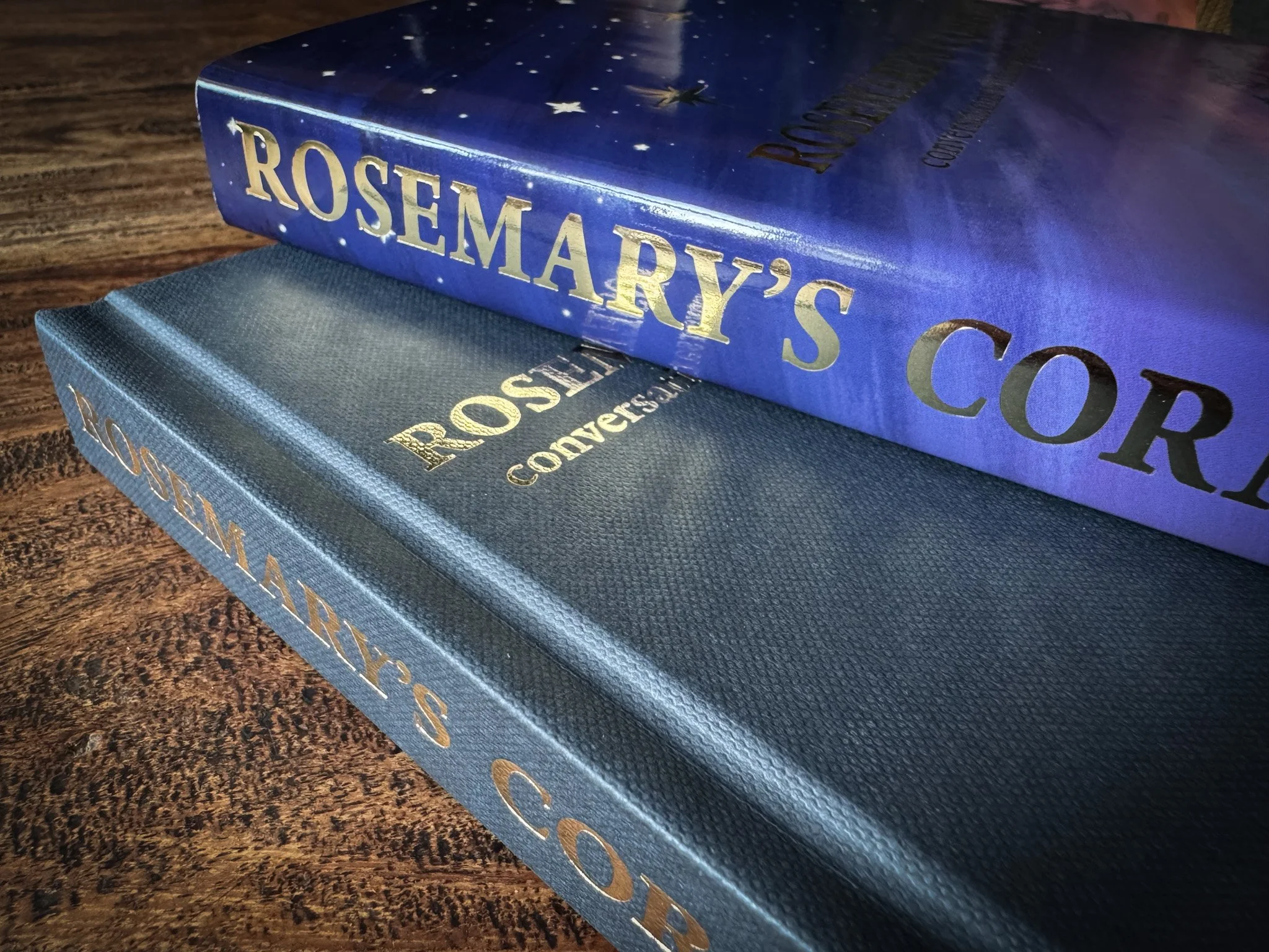
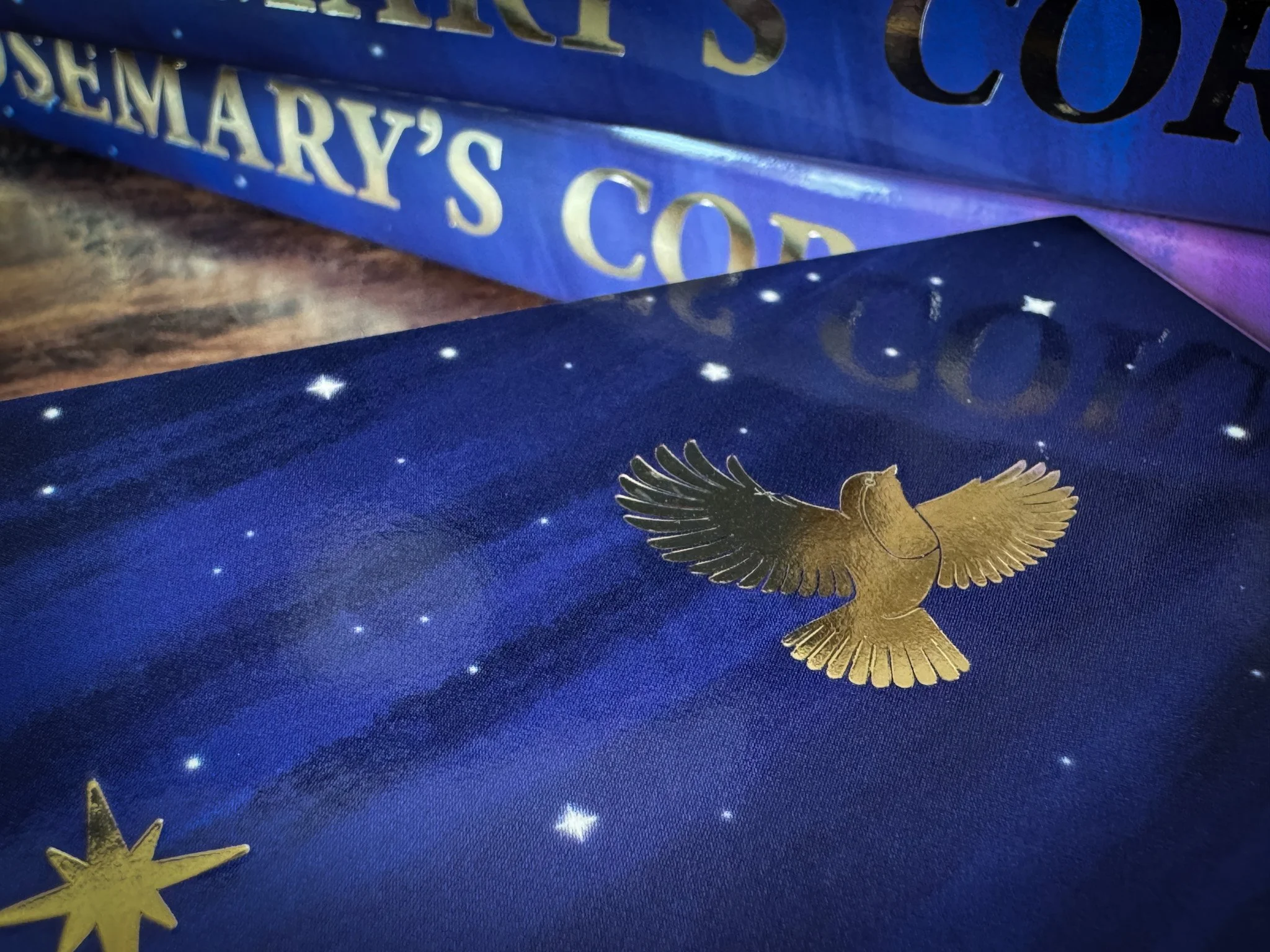
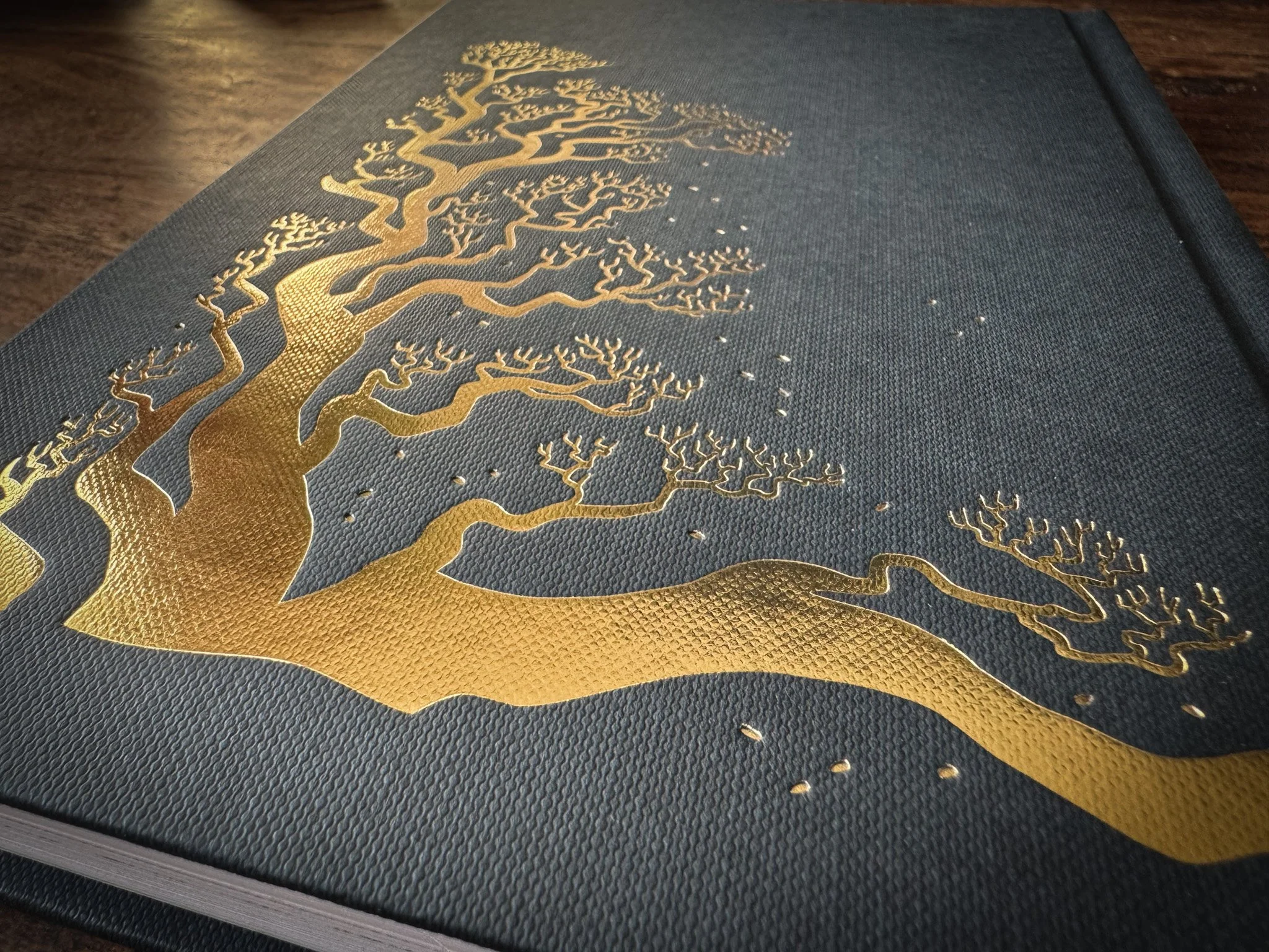
Kurz Foil Embossed Cover
Kurz Foil Embossed Cover
Kurz Foil Embossed Cover
Kurz Foil Embossed Cover
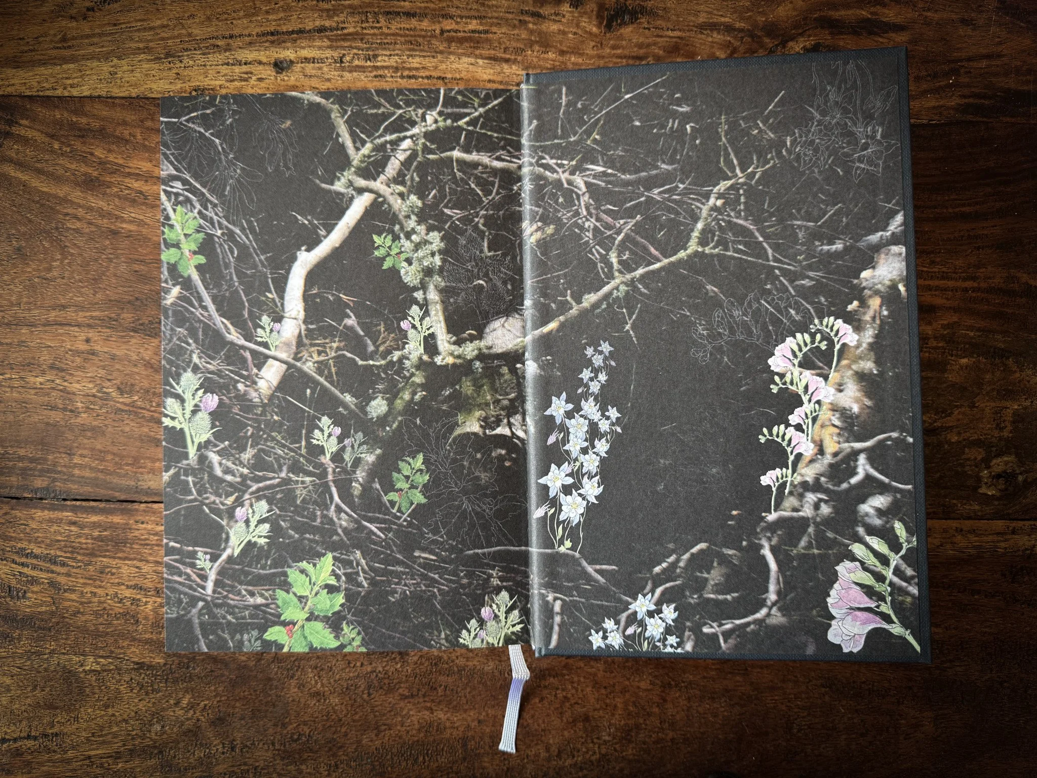
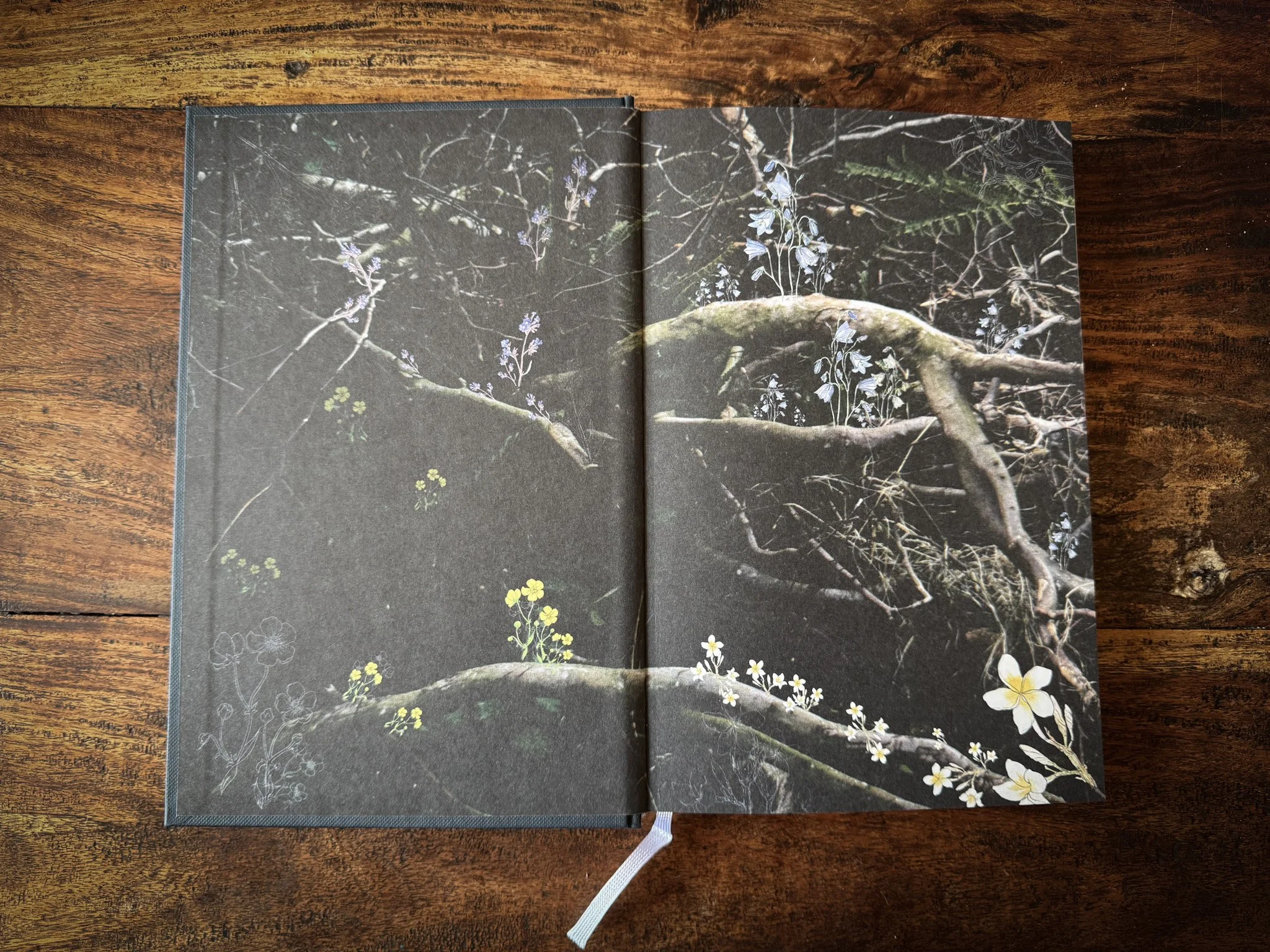
Endpapers design by Skirmantė Smažinienė and Laura (artist name: Martin)
Endpapers design by Skirmantė Smažinienė and Laura (artist name: Martin)
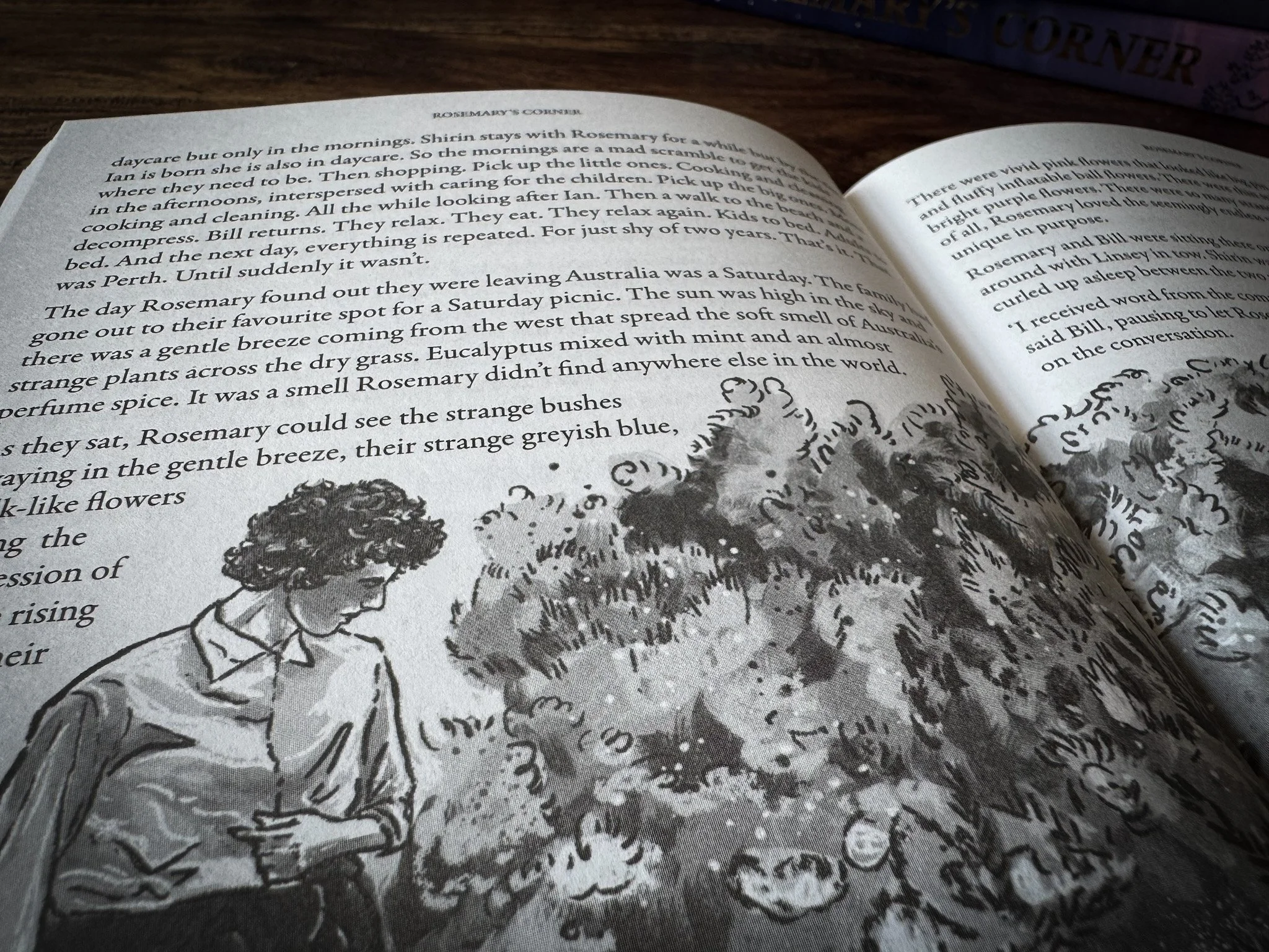
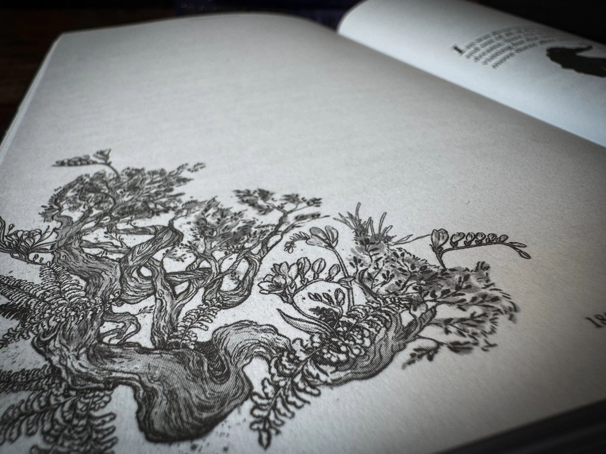
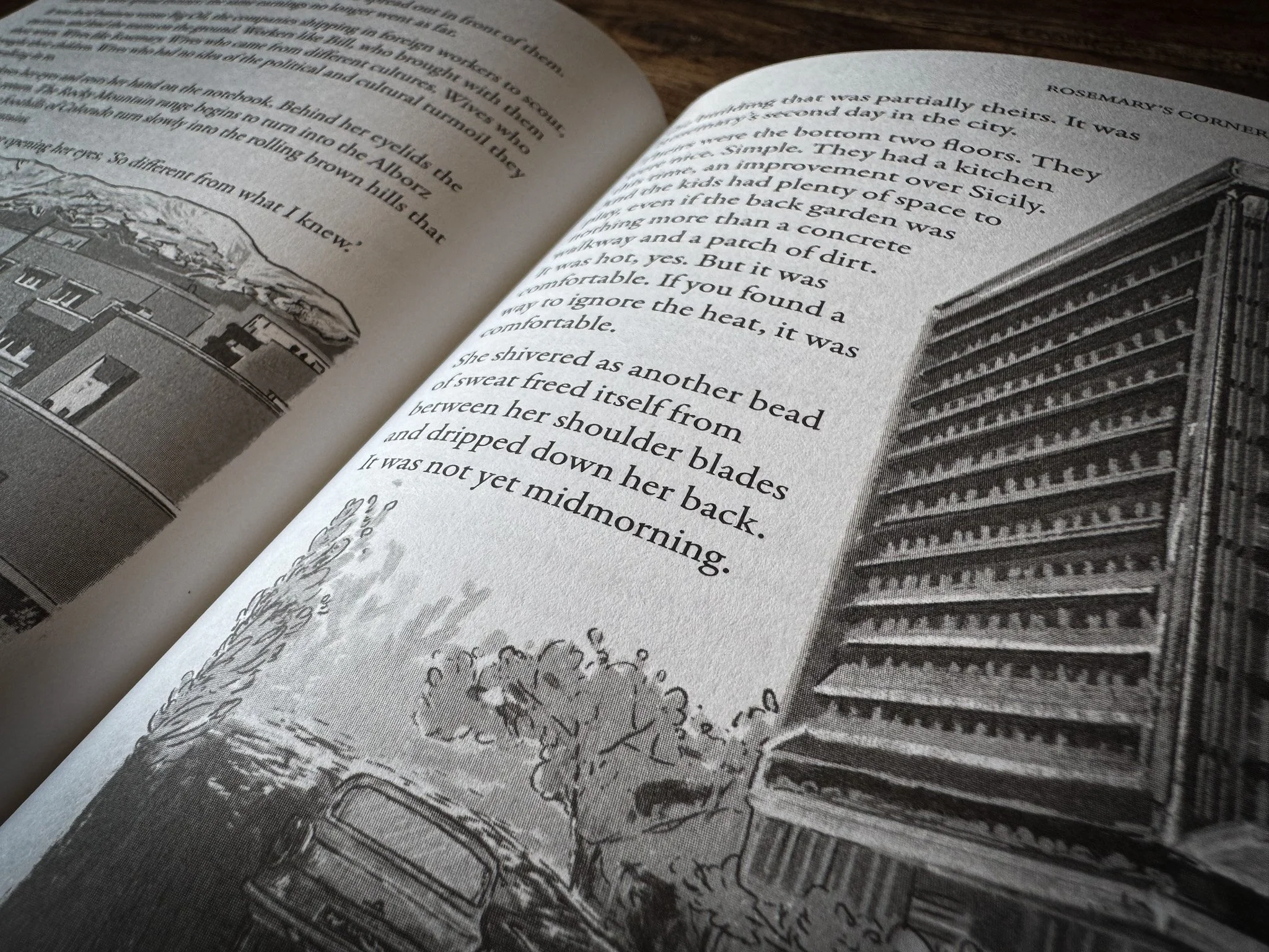
Illustrations by Georgie Croll
Illustrations by Georgie Croll
Munken Print White Paper
Munken Print White Paper
Sewn-Bound
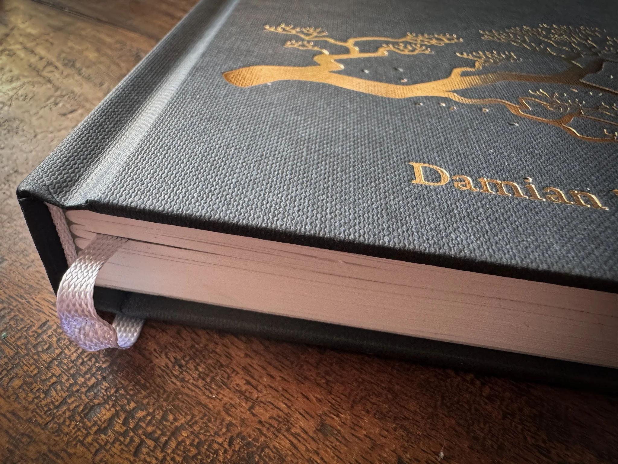
Kurz Foil Embossed Cover
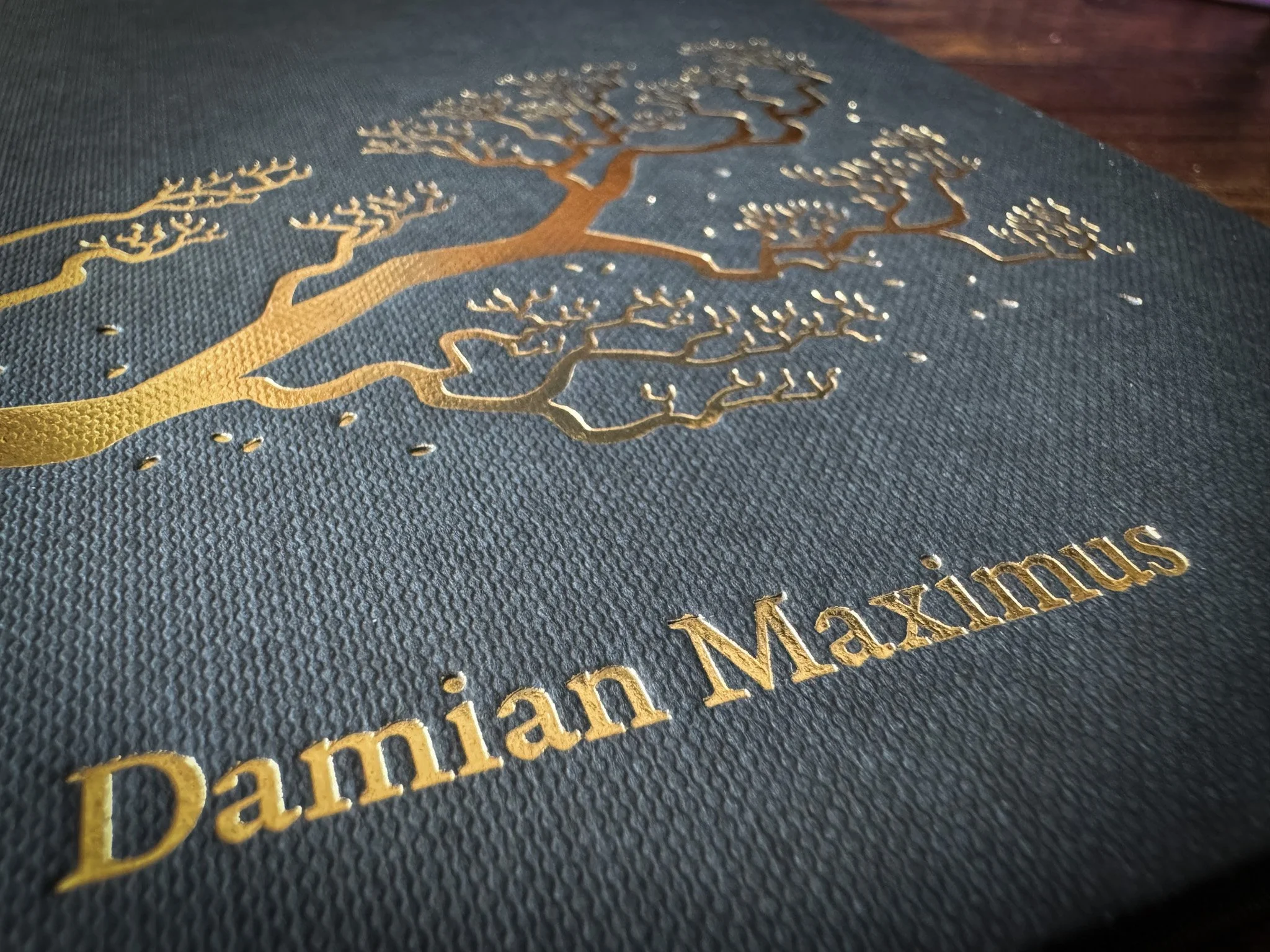
Kurz Foil Embossed Cover
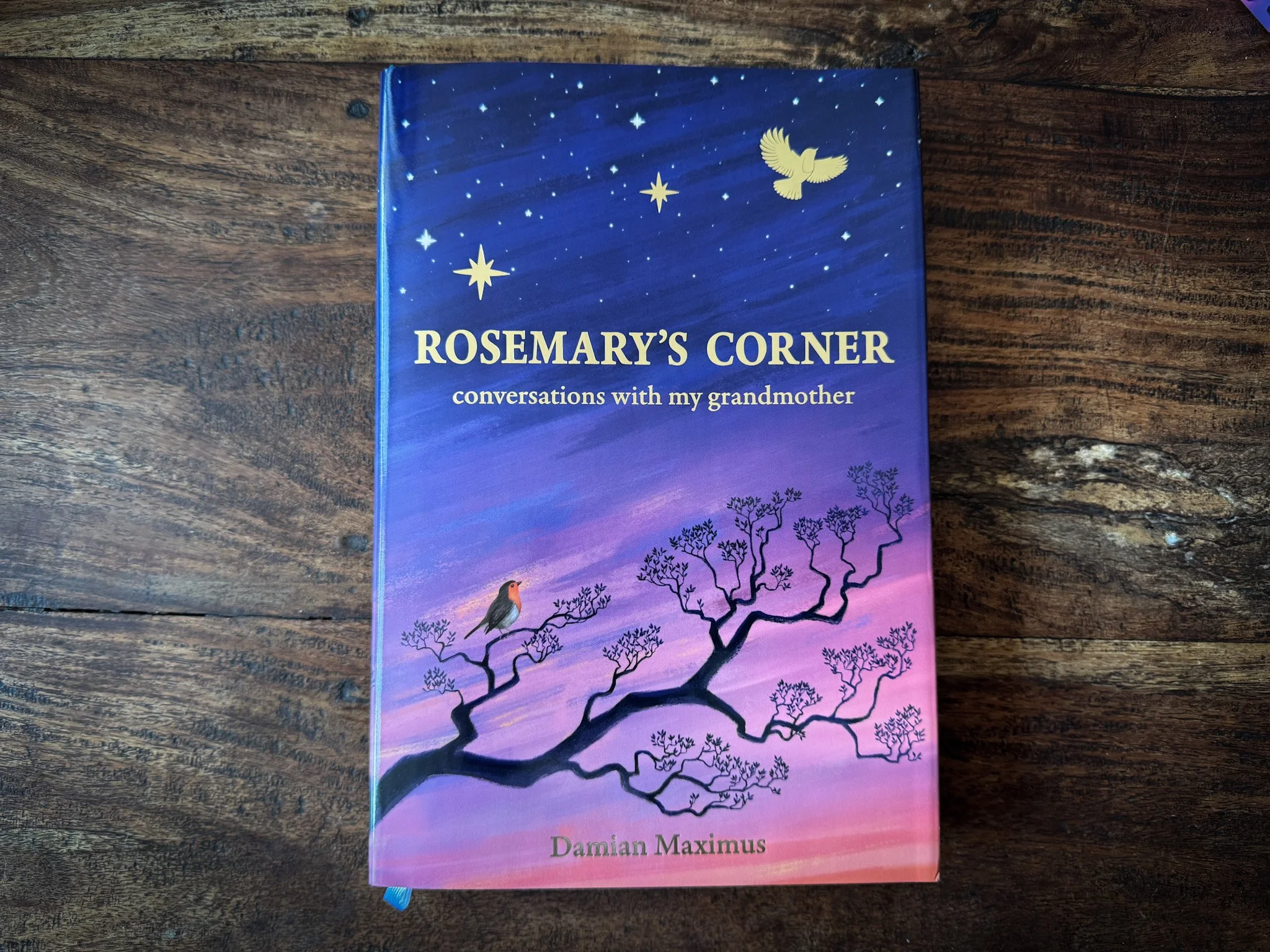
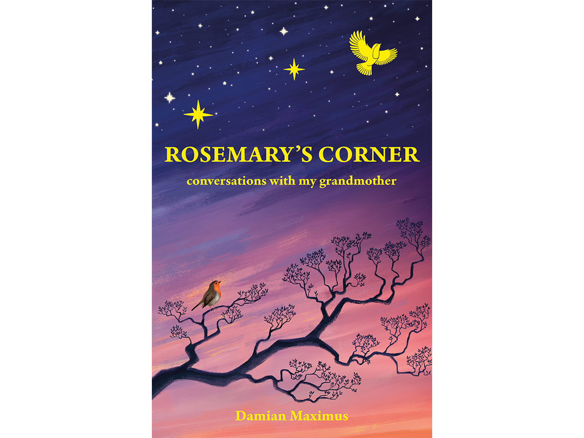
Cover and foiling design by Monika Dzikowicz
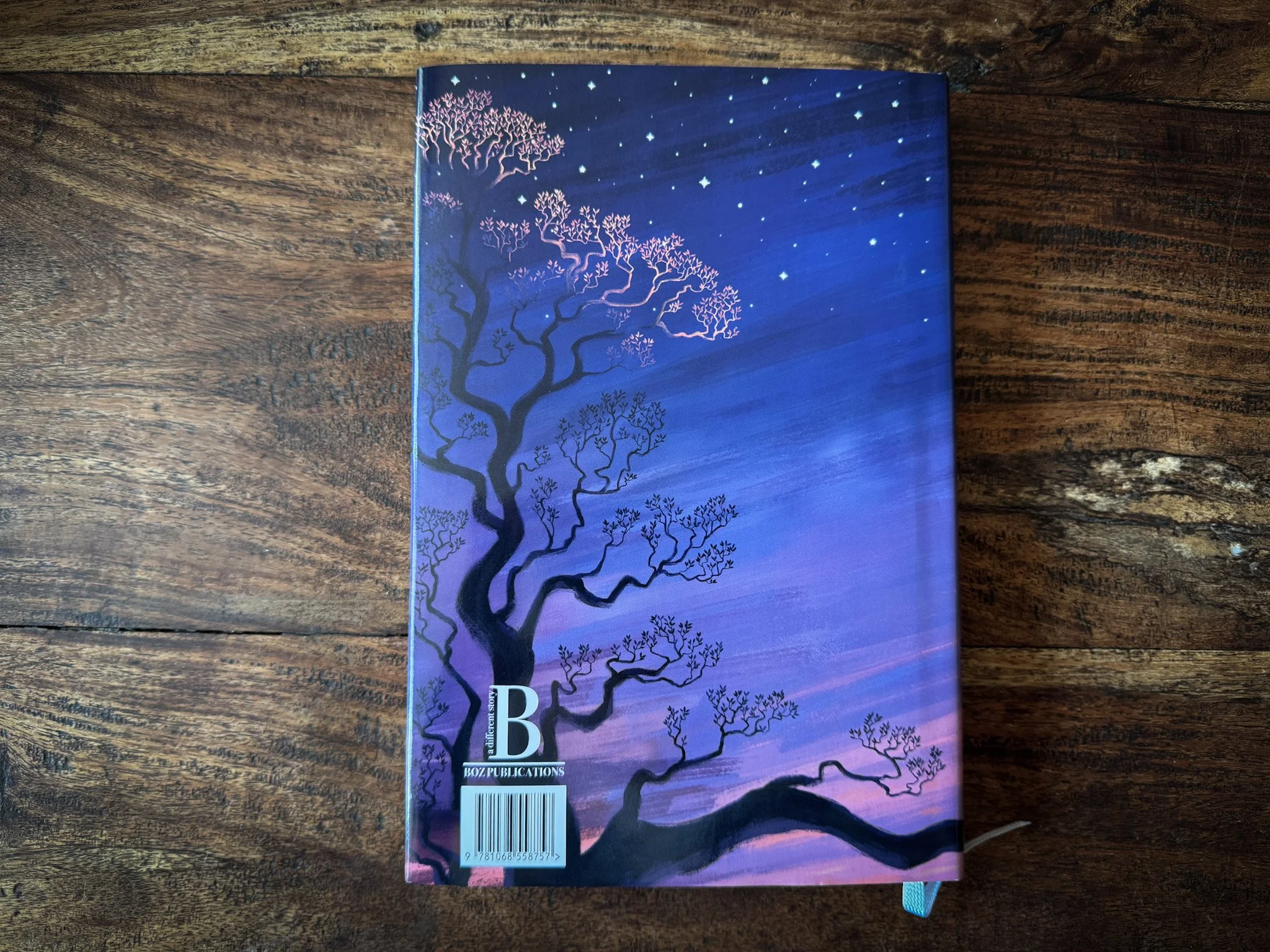
Cover and foiling design by Monika Dzikowicz
Ethically produced, limited edition hardback
Bespoke hardback.
Black and White illustrations by Georgie Croll
Cover and foiling design by Monika Dzikowicz
Endpapers design by Skirmantė Smažinienė and Laura (artist name: Martin)
212 pages.
This book uses Munken paper.
For international orders (outside the United Kingdom), please contact us at office@bozpublications.com
The art forms
This book uses many art forms to tell its story. Each expression adds value to this adventure, and it was important that materials and design reflected this.
-
Many of Rosemary's photos have been brought stunningly to life through the expert work of Georgie Croll and turned into beautiful illustrations that scatter throughout the book.
-
Photographer/painter duo Skirmante and Martin, whose work graces the end pages of the novel. Skirmante's play of light, depth, and colour in her photo of the Scottish undergrowth, overlaid with Martin's watercolour flowers that tell the geographical journey of the author’s grandmother's life, together represent a breath-taking collaboration of disciplines (not the mention the secret significance of the photo taken in Scotland, Rosemary's favourite holiday destination).
-
The cover tells a story, for when the dust jacket is removed and spread apart it shows the Robin (author) sitting upon the branch, looking up at the golden bird (grandmother) flying into the night sky. The author cannot go where she is going, he cannot live her life. But he can watch and learn.
-
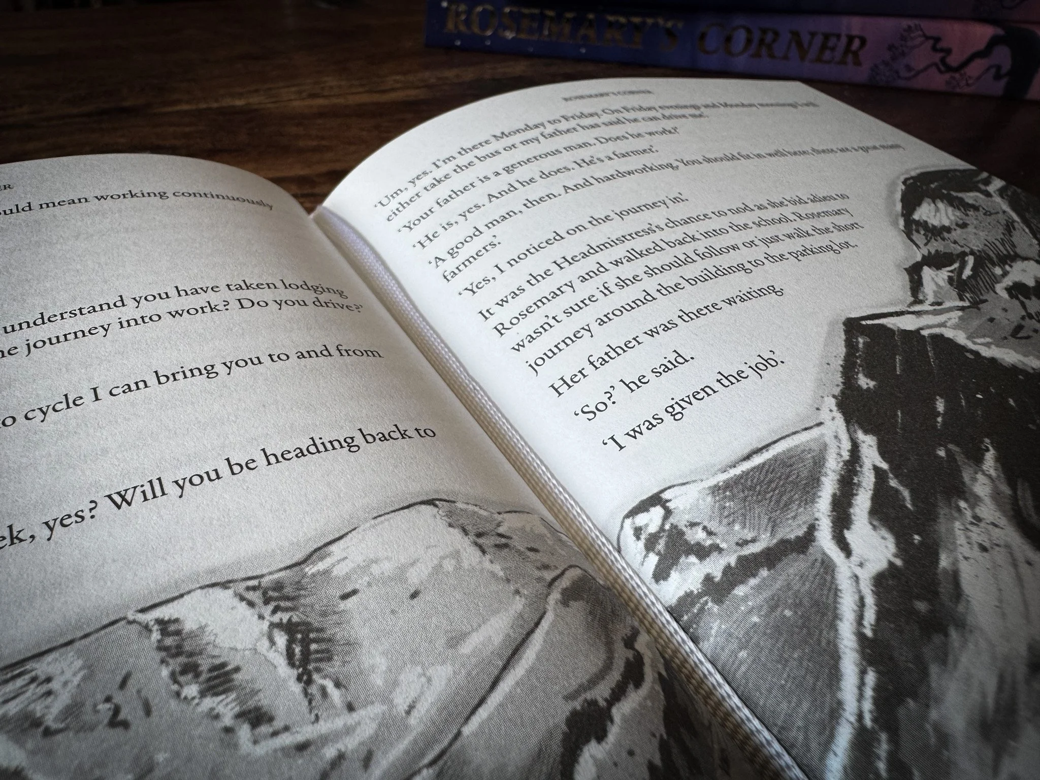
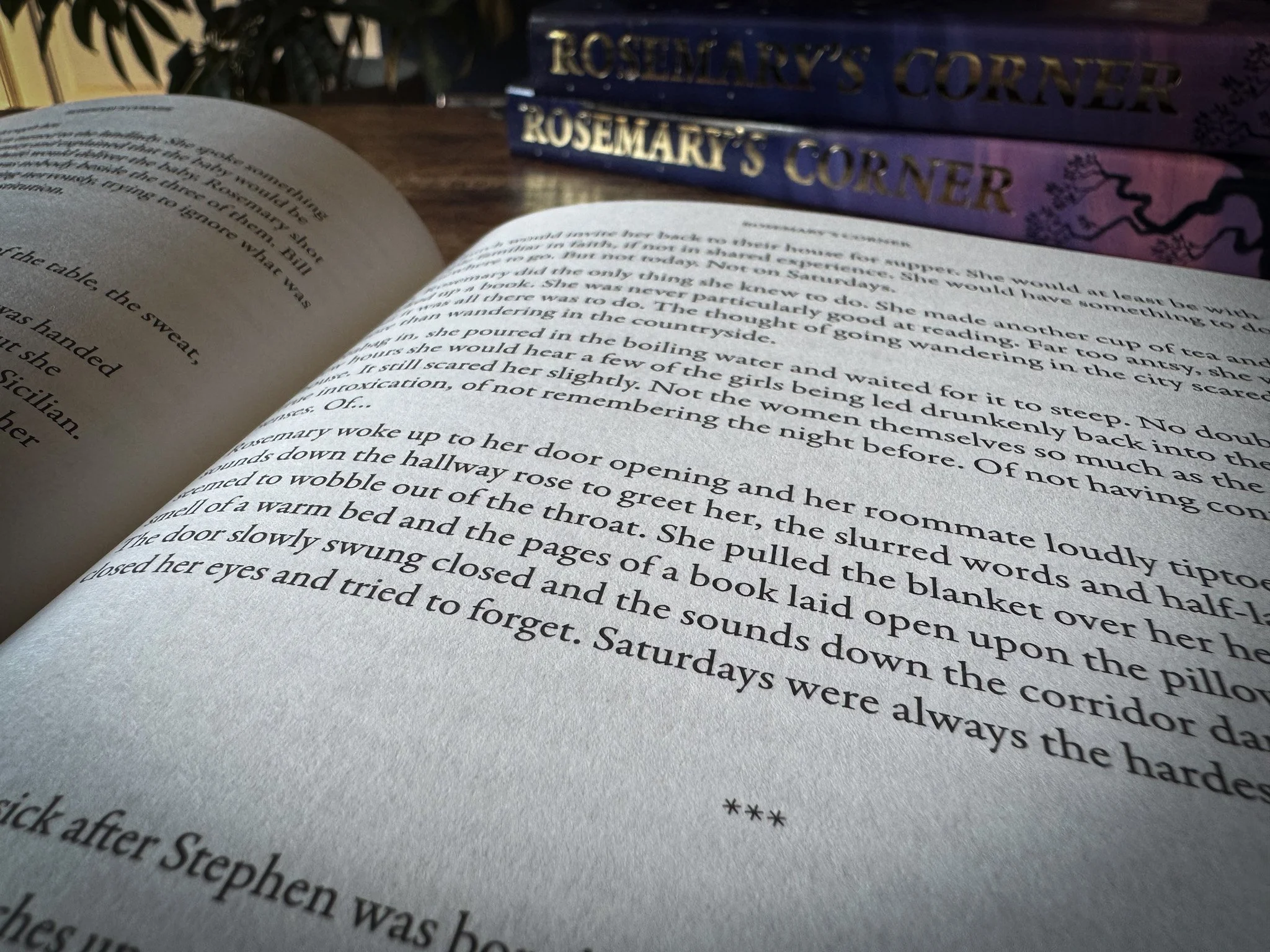
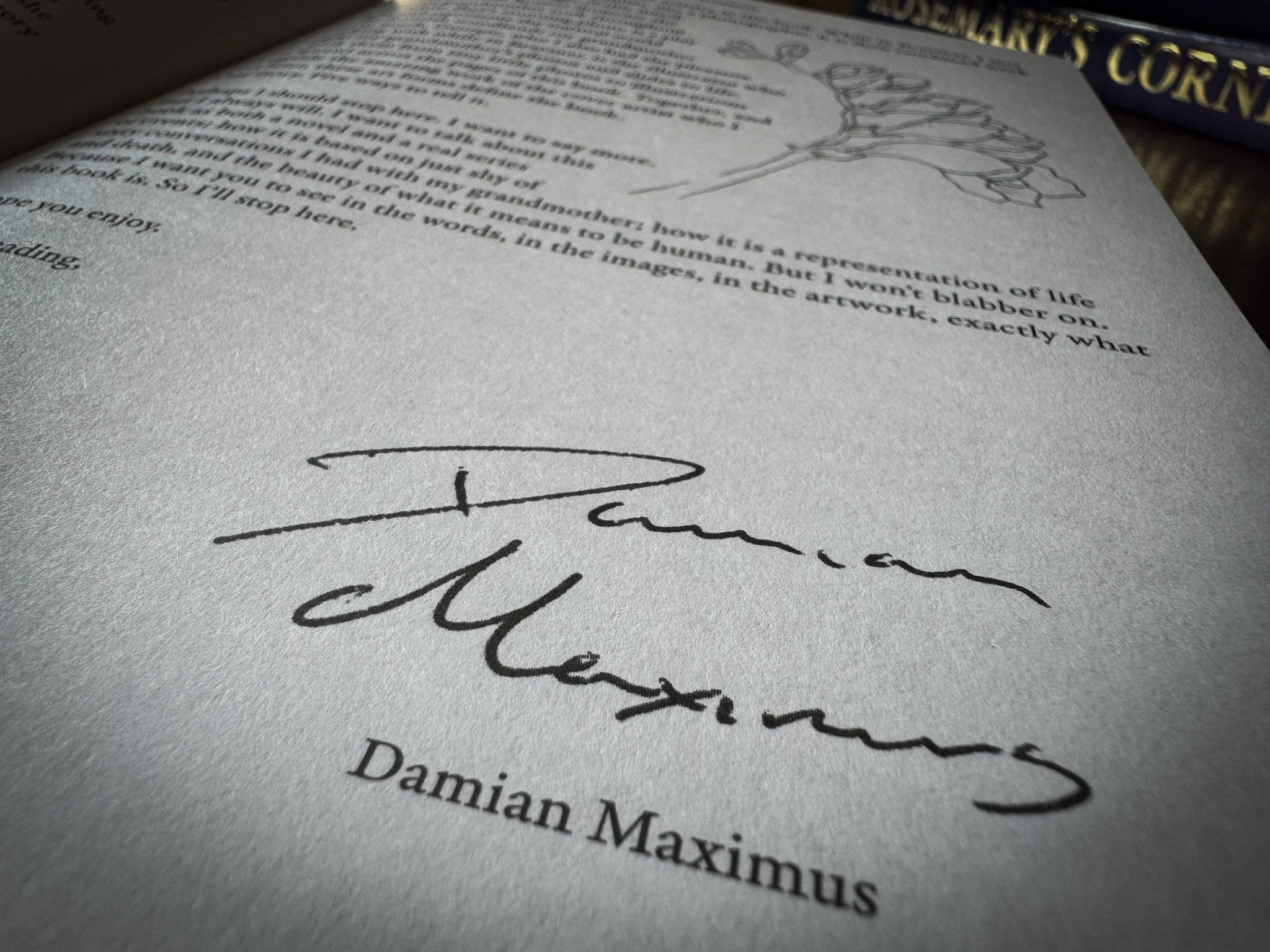
This is a personal story about a grandson and his grandmother. Damian’s writing style draws the reader into the moment, inviting them into the story. Because of this, typeface matters because it stimulates the emotions of the reader and is the entry point (or lens) of how the reader engages with the book. We went for a Sans Serif font due to its welcoming feel and old-times feel.
You could say that choosing a font is an art form.
Paper is important
We wanted a paper choice that complemented Georgie’s illustrative style. It needed to be a canvas where paper and ink could flourish and guide the reader through the text. Munken Print White was the perfect partner for this.
-
This book draws on a range of art forms to tell this story. We see paper as another form. It was important that we found the right canvas for the illustrations to come alive on the page and fit with the author's ethos and values.
We were also mindful of how this paper felt in the hand. Turnin the page is all part of the story.
-
Munken Print White combines the best properties of woodfree and wood-containing paper.
It is an uncoated paper, which helps with the feel of the page.
Uncoated papers are a good environmental choice due to their high percentage yield of fiber for recycling
-
EU Ecolabel, FSC® – The mark of responsible forestry. www.fsc.org.
FSC-C020637 and PEFC™ PEFC/05-33-99 certified.
You can view all the certificates for this paper here
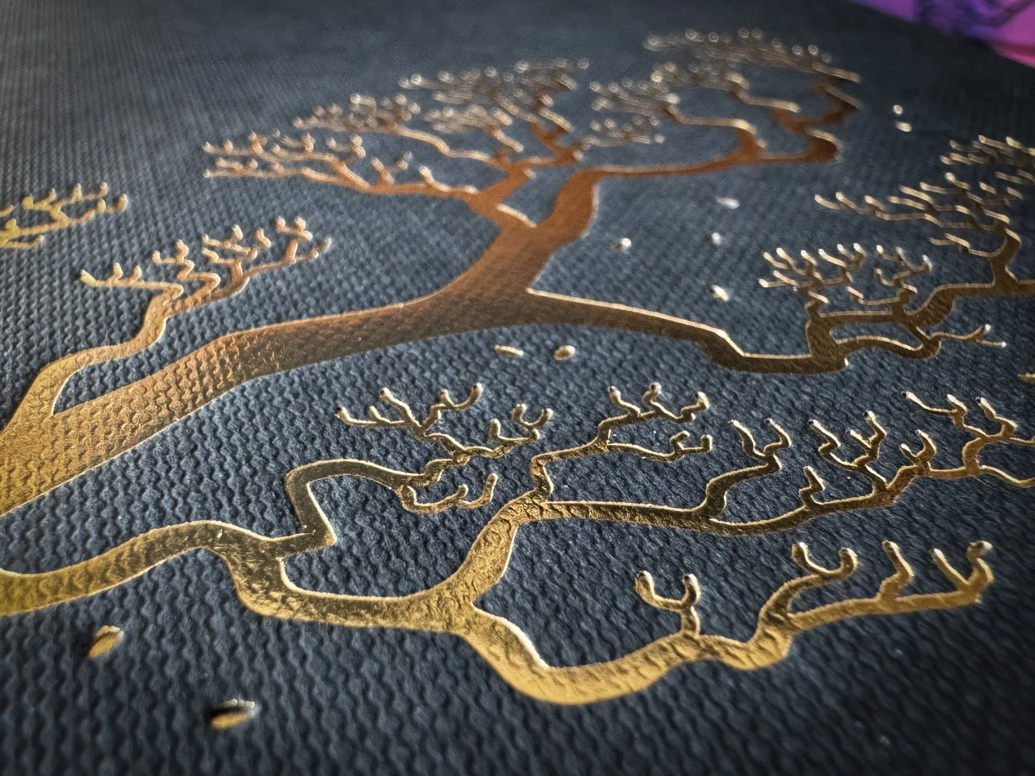
Foiling challenge
The sections we wanted to foil were extremely delicate, especially the bird's feathers and the tree branches. We didn’t want to compromise what those images represented in the story, so, through trial and error, we were able to capture the delicacy of the lines in foil. (We’re talking millimetres in adjustment).
-
Kurz Metalite 220
-
Dry process
Emissions-free
Extremely thin PET carrier
Unused material can be kept until the next application
-
The quality of the product was a major part of our decision process.
We also liked their ‘Life Cycle Thinking’.
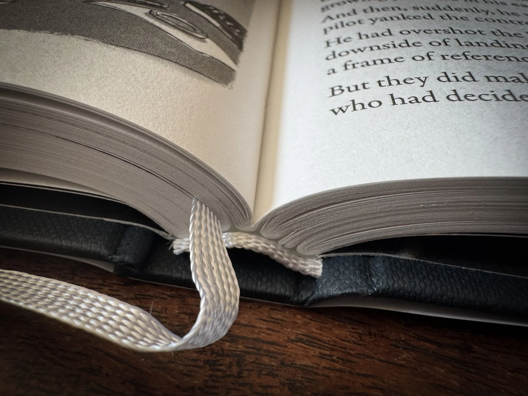
Sewn Binding
A process that focuses on durable and quality.
-
Sewn binding is an advanced binding method that gathers a group of pages together into a block, sewn, and then glued.
-
This type of method ensures a better hold over time and greater resistance to wear than perfect (glued) binding.
Pages shouldn’t fall out as they are sewn together in groups.
Due to its durable and high quality, the binding will stay together as long as the pages last, meaning the book carries a longer shelf life.
Ethically produced, limited edition hardback
Bespoke hardback.
Black and White illustrations by Georgie Croll
Cover and foiling design by Monika Dzikowicz
Endpapers design by Skirmantė Smažinienė and Laura (artist name: Martin)
212 pages.
This book uses Munken paper.
For international orders (outside the United Kingdom), please contact us at office@bozpublications.com